Aperta
Aperta
An platform for people with disabilities and medical issues.

Aperta
An platform for people with disabilities and medical issues.
Intro
People with disabilities and other medical issues oftentimes struggle with finding others around them who are experiencing similar issues to them. They may not be able to find communities that they feel like they belong in. They may not be able to ask personal questions that only others with similar issues to them can relate to.
Project Goals
People with disabilities and other medical issues oftentimes struggle with finding others around them who are experiencing similar issues to them. They may not be able to find communities that they feel like they belong in. They may not be able to ask personal questions that only others with similar issues to them can relate to.
Project Background:
This project was made as part of a semester-long university course in which each student was responsible for coming up with their own creative projects. Students would iterate on their projects over the course of the semester and get feedback from their peers multiple times during the semester.


Taskflow
Taskflow
Sources of Inspiration
Sources of Inspiration
Disabilities
Potential Features
Potential Features
All Notes
All Notes
Brainstorming
Stickynotes
Early on during the process of researching for the project, I decided to use sticky notes to aid the brainstorming process. Sticky notes labelled "sources of inspiration" focused on different social media platforms that inspired Aperta initially, such as Spokin and Allergy Eats. I also had a set of sticky notes labeled "disabilities", and these included notes about various disabilities such as ADHD/ADD and visual impairment. The last of the notes looked at potential features for Aperta, like users having posts, a feed, etc.
A hierachal task flow was created in Figjam that focused on the various pages in the app, the navigation process for the users, and the different features the app has.
Taskflow
A hierarchical task flow was created in Figjam that focused on the various pages in the app, the navigation process for the users, and the different features the app has.
A hierachal task flow was created in Figjam that focused on the various pages in the app, the navigation process for the users, and the different features the app has.


Aperta Version #1 - Low Fidelity Mockups
Aperta Version #1 - Low Fidelity Mockups
I created a set of low-fidelity wireframes to get a basic idea of how the app should look and what the structure of it should be. In the prototype version there were two screens focused on the user creating their profile. There would be a dedicated account page, a feed page that would also serve as the home page, a page where users could find areas near them that accommodated their disabilities, and a page focused on disabilities.
I created a set of low-fidelity wireframes to get a basic idea of how the app should look and what the structure of it should be. In the prototype version there were two screens focused on the user creating their profile. There would be a dedicated account page, a feed page that would also serve as the home page, a page where users could find areas near them that accommodated their disabilities, and a page focused on disabilities.

Aperta Version #1 Feedback
Aperta Version #1 Feedback
Overall, students were positive about the wireframes with the understanding that the project was in its early stages and would be further revised as it went on. Multiple students had advice regarding different accessibility features they felt would be nice for me to add. These suggestions included the addition of voice-to-text, a dark mode, a high-contrast mode, a button for customizing text font size, etc. Some recommended features to add were reviews and ratings based on the accessibility of a location.
Overall, students were positive about the wireframes with the understanding that the project was in its early stages and would be further revised as it went on. Multiple students had advice regarding different accessibility features they felt would be nice for me to add. These suggestions included the addition of voice-to-text, a dark mode, a high-contrast mode, a button for customizing text font size, etc. Some recommended features to add were reviews and ratings based on the accessibility of a location.
Aperta Version #2
Aperta Version #2
I decided to make some pretty drastic changes to the project after the initial prototype. I felt that the app was trying to incorporate too many features and that it would benefit the app to make the scope smaller. The initial idea was that users would make posts and that users would also be able to look at locations and see if those locations would be able to properly accommodate their disabilities. However, I felt that it would benefit the app to focus more on the idea of users making their own posts and commenting on and liking those posts. So I got rid of the features related to users finding places to see how accommodating they were to their disabilities. The app now was focused more on its social features.
I decided to make some pretty drastic changes to the project after the initial prototype. I felt that the app was trying to incorporate too many features and that it would benefit the app to make the scope smaller. The initial idea was that users would make posts and that users would also be able to look at locations and see if those locations would be able to properly accommodate their disabilities. However, I felt that it would benefit the app to focus more on the idea of users making their own posts and commenting on and liking those posts. So I got rid of the features related to users finding places to see how accommodating they were to their disabilities. The app now was focused more on its social features.
Afterwards, I began to build a higher-fidelity version of the app that incorporated a green and black color scheme that I felt would be visually appealing to users. I included mockups for users logging in and creating their accounts. The create accounts mockups included screens for putting in basic information and additional screens for denoting what disabilities they have. Additional screens that were created included a home page screen where a user’s feed would be, a post page that would also include comments, a screen for finding new groups, and a screen for an account page.
Afterwards, I began to build a higher-fidelity version of the app that incorporated a green and black color scheme that I felt would be visually appealing to users. I included mockups for users logging in and creating their accounts. The create accounts mockups included screens for putting in basic information and additional screens for denoting what disabilities they have. Additional screens that were created included a home page screen where a user’s feed would be, a post page that would also include comments, a screen for finding new groups, and a screen for an account page.

Aperta Version #2 Feedback
Aperta Version #2 Feedback
Overall, the other students liked this in-progress version of the app. I did get some suggestions to incorporate more user accessibility settings that would fit the target audience. Furthermore, from a visual standpoint, I was told that the dark background with the white text might have been too much contrast for users and that I should lower the contrast if possible. Also, I was told that the text might have been too small for users and that certain elements need to be moved around to improve the app experience.
Overall, the other students liked this in-progress version of the app. I did get some suggestions to incorporate more user accessibility settings that would fit the target audience. Furthermore, from a visual standpoint, I was told that the dark background with the white text might have been too much contrast for users and that I should lower the contrast if possible. Also, I was told that the text might have been too small for users and that certain elements need to be moved around to improve the app experience.


Aperta Version #3
Aperta Version #3
For the 3rd version of the Aperta app, I created new screens for searching and for messages. I also created a series of frames for creating posts. This includes frames for writing text for the post, adding images to the post, finding groups to add the post to, finding post categories for the post, and a post preview screen. I also made minor cosmetic changes to the app, like tweaking the shade of white for the text boxes in the login and creating account frames to one that’s slightly darker and changing the shade of black used in all of the Aperta frames to one less strong. These changes in color tones helped to soften the contrast in the app a little bit. I added a create account button in the create account page instead of having a small bit of text telling people to sign up for an account. I also increased the text size to improve the app's readability.
For the 3rd version of the Aperta app, I created new screens for searching and for messages. I also created a series of frames for creating posts. This includes frames for writing text for the post, adding images to the post, finding groups to add the post to, finding post categories for the post, and a post preview screen. I also made minor cosmetic changes to the app, like tweaking the shade of white for the text boxes in the login and creating account frames to one that’s slightly darker and changing the shade of black used in all of the Aperta frames to one less strong. These changes in color tones helped to soften the contrast in the app a little bit. I added a create account button in the create account page instead of having a small bit of text telling people to sign up for an account. I also increased the text size to improve the app's readability.
Aperta Version #3 Feedback
Aperta Version #3 Feedback
Aperta Final Version
Aperta Final Version
Students seemed to be pretty positive about the 3rd version of the app, generally speaking. I got feedback about making some cosmetic tweaks to the app. Some people looking at the app found that the white text on top of buttons that were green made it harder to read the text. It was suggested that I either make the text or the background a bit darker to make the text easier to read. Also in the messaging screen, it was suggested that I align the profiles more to the left and expand the text width to improve the text readability.
Students seemed to be pretty positive about the 3rd version of the app, generally speaking. I got feedback about making some cosmetic tweaks to the app. Some people looking at the app found that the white text on top of buttons that were green made it harder to read the text. It was suggested that I either make the text or the background a bit darker to make the text easier to read. Also in the messaging screen, it was suggested that I align the profiles more to the left and expand the text width to improve the text readability.
For the final version of the app, I made a large number of changes to the Aperta app to make the user experience improved and more refined. First, when users originally opened up the app, they were immediately taken to a login page, and they had the option of going to another page to create their account. I changed this in the final version to where users, when opening the app, will be greeted with a welcoming page where users have the option to create an account or log in. I made a new create account page that gives users the option to create an account using their email or with different social media accounts. I re-did the continue button so that there is no longer white text with a white arrow on top of a green background. Now the button is white with black text and no arrow. The button will also be greyed out until the user enters in all of the necessary information.
For the final version of the app, I made a large number of changes to the Aperta app to make the user experience improved and more refined. First, when users originally opened up the app, they were immediately taken to a login page, and they had the option of going to another page to create their account. I changed this in the final version to where users, when opening the app, will be greeted with a welcoming page where users have the option to create an account or log in. I made a new create account page that gives users the option to create an account using their email or with different social media accounts. I re-did the continue button so that there is no longer white text with a white arrow on top of a green background. Now the button is white with black text and no arrow. The button will also be greyed out until the user enters in all of the necessary information.
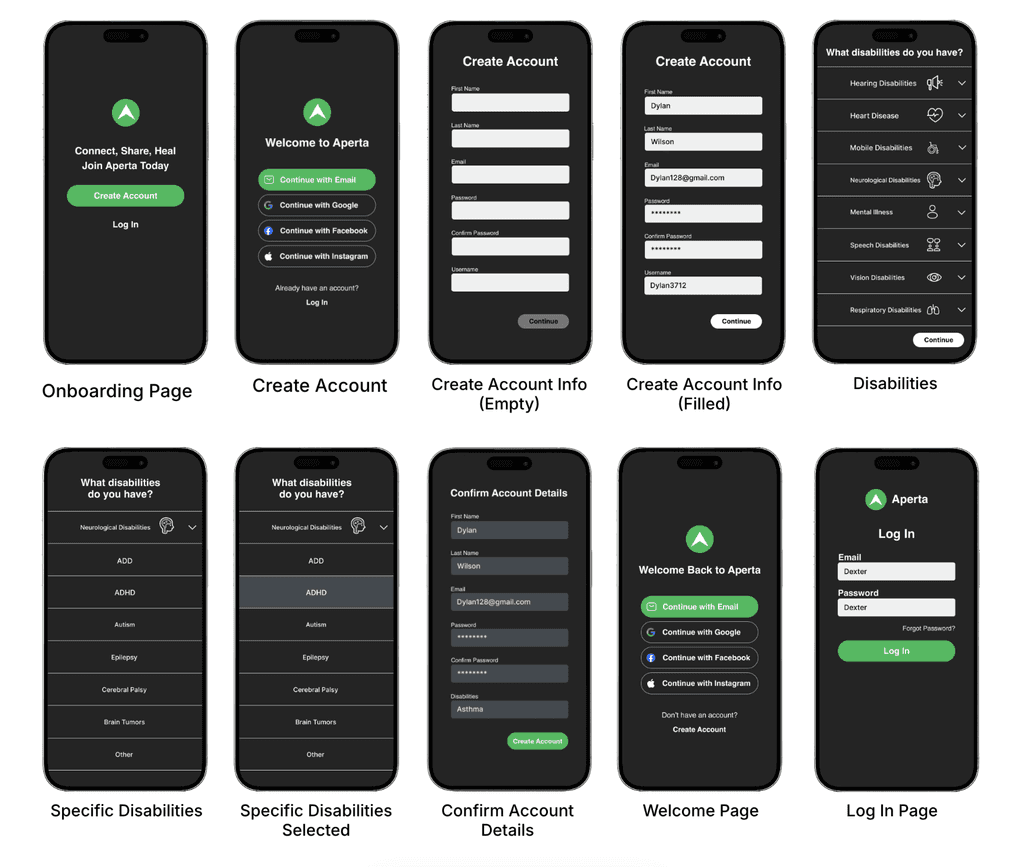
When it came to the appearance of posts on the home page and posts page, I made a number of changes. First, I got rid of the heart button for liking posts, and instead there’s a new button for upvoting and downvoting posts. I also got rid of the button for bookmarking, as users will be able to find that by clicking on the 3 dots at the top of the posts to see options for that and more. I made numerous changes to the appearance of the account page; elements such as the number of followers and people the user is following now are no longer boxed, and instead the user will just see the number of those elements being displayed. I also added a page for notifications and a page that shows users chatting with each other. For the messages page, I moved the icons for the messages to the left to improve visual appeal.
Intro
People with disabilities and other medical issues oftentimes struggle with finding others around them who are experiencing similar issues to them. They may not be able to find communities that they feel like they belong in. They may not be able to ask personal questions that only others with similar issues to them can relate to.
Disabilities
Project Background:
This project was made as part of a semester-long university course in which each student was responsible for coming up with their own creative projects. Students would iterate on their projects over the course of the semester and get feedback from their peers multiple times during the semester.
For the final prototype I also made the green color used for buttons and for the logo darker so that users would have an easier time reading the text. I also caught a mistake I made where some of the plus icons were white while others were black. In the final prototype, they’re all white. Flairs were also changed to now only appear on the pages of posts instead of also showing up on the home page. I changed the color of the boxes from being a rich shade of gray to one being more of a muted blue color, as I felt it looked more aesthetically appealing. For the post preview and post page, the image of the inhaler was made bigger.

Interactive Prototype
Conclusion
The overall goal of Aperta was to provide users with a platform where they can post about different disabilities and medical conditions they might have and interact with others with similar conditions. I do feel that app was able to deliver on those goals. Next steps for the application would be to include further accessibility options for users who have issues interacting with an app in it's current state. Also, being able to showcase posts from actual doctors and researchers, people with expertise in these topics, would be very beneficial to the app since people seeking real advice regarding these issues can hear well informed opinions.
For the final prototype I also made the green color used for buttons and for the logo darker so that users would have an easier time reading the text. I also caught a mistake I made where some of the plus icons were white while others were black. In the final prototype, they’re all white. Flairs were also changed to now only appear on the pages of posts instead of also showing up on the home page. I changed the color of the boxes from being a rich shade of gray to one being more of a muted blue color, as I felt it looked more aesthetically appealing. For the post preview and post page, the image of the inhaler was made bigger.
When it came to the appearance of posts on the home page and posts page, I made a number of changes. First, I got rid of the heart button for liking posts, and instead there’s a new button for upvoting and downvoting posts. I also got rid of the button for bookmarking, as users will be able to find that by clicking on the 3 dots at the top of the posts to see options for that and more. I made numerous changes to the appearance of the account page; elements such as the number of followers and people the user is following now are no longer boxed, and instead the user will just see the number of those elements being displayed. I also added a page for notifications and a page that shows users chatting with each other. For the messages page, I moved the icons for the messages to the left to improve visual appeal.
Interactive Prototype
For the final prototype I also made the green color used for buttons and for the logo darker so that users would have an easier time reading the text. I also caught a mistake I made where some of the plus icons were white while others were black. In the final prototype, they’re all white. Flairs were also changed to now only appear on the pages of posts instead of also showing up on the home page. I changed the color of the boxes from being a rich shade of gray to one being more of a muted blue color, as I felt it looked more aesthetically appealing. For the post preview and post page, the image of the inhaler was made bigger.
Conclusion
The overall goal of Aperta was to provide users with a platform where they can post about different disabilities and medical conditions they might have and interact with others with similar conditions. I do feel that app was able to deliver on those goals. Next steps for the application would be to include further accessibility options for users who have issues interacting with an app in it's current state. Also, being able to showcase posts from actual doctors and researchers, people with expertise in these topics, would be very beneficial to the app since people seeking real advice regarding these issues can hear well informed opinions.
When it came to the appearance of posts on the home page and posts page, I made a number of changes. First, I got rid of the heart button for liking posts, and instead there’s a new button for upvoting and downvoting posts. I also got rid of the button for bookmarking, as users will be able to find that by clicking on the 3 dots at the top of the posts to see options for that and more. I made numerous changes to the appearance of the account page; elements such as the number of followers and people the user is following now are no longer boxed, and instead the user will just see the number of those elements being displayed. I also added a page for notifications and a page that shows users chatting with each other. For the messages page, I moved the icons for the messages to the left to improve visual appeal.